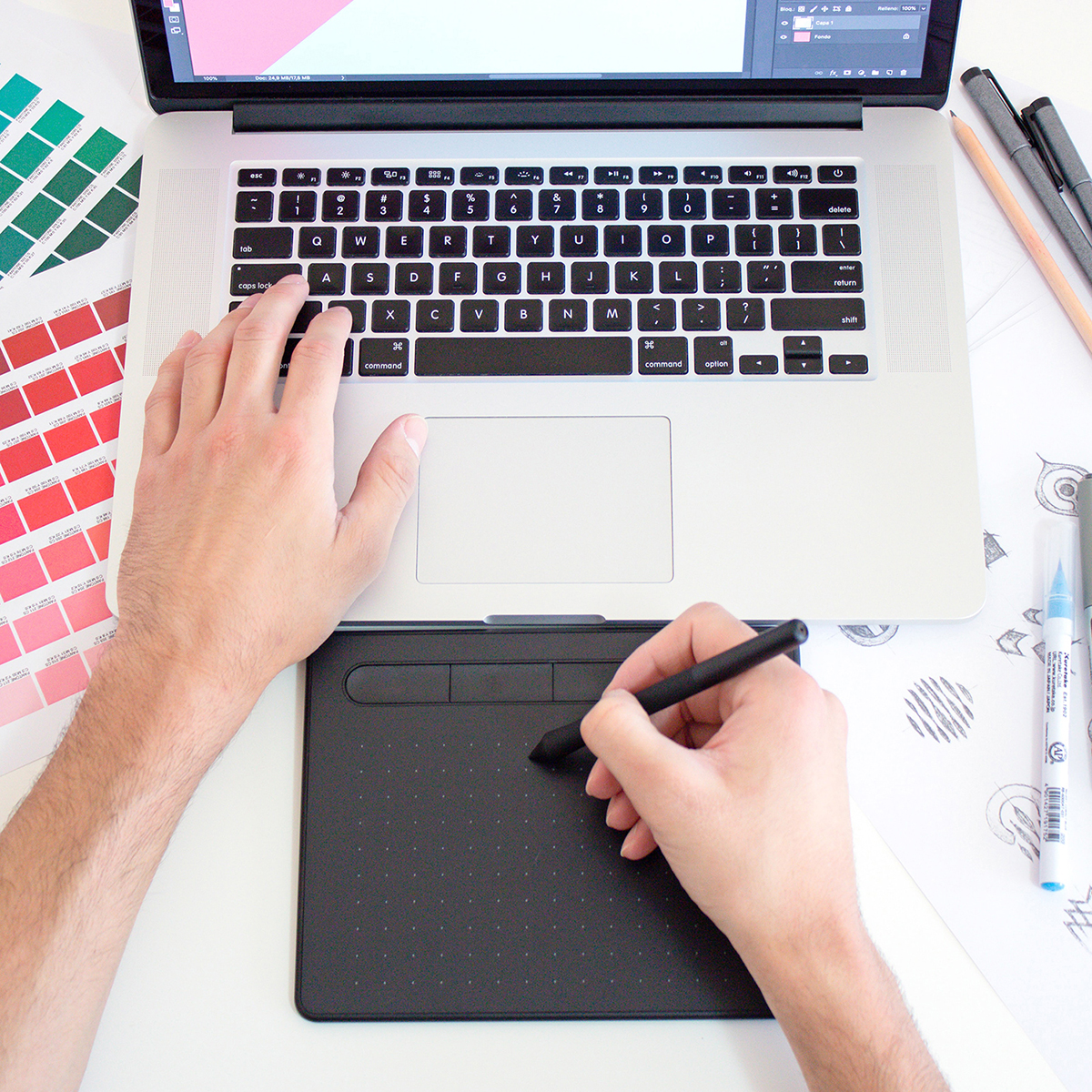
When I was taking graphic design courses in college for my degree, I can honestly say they did not prepare me for the real world. Two years after graduating with my BFA I found myself working for a printing company (this very one you’re reading the blog of). And after handing in my first design “assignment” to prepress, I got a whole new education. Fast forward 15+ years and I still don’t know everything, and I still get yelled at by prepress—I jest, I jest. But truthfully, my schooling might have taught me design principles and how to use the software, but it didn’t teach me how to prepare files for production. Maybe they teach these things now, or they did where you went to school, but if they didn’t, stick around and I’ll share what I know now.
Make sure to allow for bleeds. In school, we did one off prints from the large format printer. We cut pieces out by hand with an Xacto knife. Bleed really wasn’t necessary for our purposes. But the first time I prepped a file for production and didn’t have bleed pulled, I learned very quickly to not forget this step. The first thing I do when I create a new document is set the bleed to 1/8″ on all sides so that red border is right there in my face reminding me to account for it in my design. It’s crucial for achieving the best finished product. Not only should solid background colors and patterns be extended by 1/8″ past the edge of the page, but even more importantly, any photos or graphics that will butt up to the edge need to have extra image available for bleed.
Setting up files based on finishing. My InDesign default for a new document is facing pages. And if you’re designing a saddle stitch book, it is best to design in two page spreads. For wire-o or perfect bound books though, it’s a must to design as single pages in your document, because we need bleeds on all four sides of every page (we discussed this in depth HERE) for production purposes. If you’re designing a folded brochure, you may be tempted to create individual pages in your document for each panel. But brochures should be designed as one page built to the flat size of the brochure (one for the inside, one for the outside). And depending on how it folds, will dictate the size of each panel. For roll folds, each panel that folds in should be 1/16″ smaller than the previous. Paper bulks up and has to go somewhere when it’s folded, so factoring in those slight shifts in panel size will make all the difference. For accordion brochures, each panel can be the same. For double parallel, the two inner need to be 1/16″ smaller than the two outer.
Save 4-color black for large areas. This is possibly a bit controversial, but I’d recommend setting your type with black only (assuming you want black type). Not 4-color (super) black, just regular black. I think this stems primarily from the Registration swatch in most design software palettes. It really shouldn’t be an issue because we have to be in register anyway, but if you want to use super black, I’d keep it to areas where it will really have an impact, not on your 12pt type.
No need for printer spreads or imposed files. They’re not necessary. Prepress nowadays has imposition software that takes a high res PDF of your design file and imposes it based on the layout we need for production, even factoring in the appropriate amount of push based on stock weight for books. Printer spreads or imposed files will have to be deconstructed before we can process them, so why go through the headache. The only instance where this wouldn’t be an issue is if we’re just doing the printing and supplying flat press sheets back to you.
And some bonus tips!
Consider your design in real life. With almost everything existing solely in the digital realm, including a lot of proofs these days, it’s a really good practice to create a mockup to see exactly how your design will interact with itself in a physical space. How do the brochure panels reveal themselves next to the previous panel as you open each one up? Is the scale what you imagined? If possible, print the mockup to size. It makes all the difference.
And think about cross page line up! Does your design really need a cross page design element? Like a rule or border? If it doesn’t, I would forgo it for the sake of simplicity (in design and production). Does that photo need to cross to both pages? If it’s a full 2-page spread, perhaps the impact is worth it. This may just be a personal preference, in which case, please ignore. But what I’ve learned since seeing design go from digital to a real life product every day for 15 years, is that cross page elements tend to look better on a screen in the 2D realm. Also, I would advise against having type cross over from one page to another, especially if a letter is right at the spine. If it’s the center spread, maybe. Maybe.
***
I hope these tips were helpful. They’re certainly things one learns with experience. Usually the hard way.
Photo by Theme Photos on Unsplash

